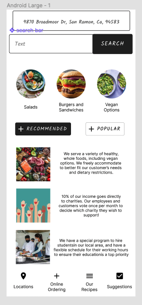
 1) The process of adding the graphics was mostly easy, but there was a couple of times when I couldn't get rid of text (like the purple text that says search bar).
2) The easiest part of the activity was adding in the pictures to the squares and circles we previously set. 3) The most difficult part for me was coming up with the three pictures/captions under the recommended button, I couldn't really think of what to put for a bit. 4) I chose these menu items because I wanted it to be accessible for a lot of people, hence why they can check our different locations or even online order. Also, I really wanted this restaurant to feel like a part of the community, which is why I encourage the customers to try to learn some of our recipes. Lastly, to be a successful restaurant that's for the people, I find I to be very important to take in suggestions for how to do something better.
0 Comments
User ExperienceVideo
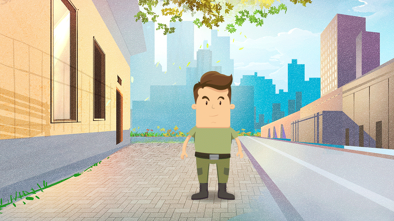
How do you feel after watching that video? It was a wake up call to hear just how much design can impact someone, and how much it can exclude when it's not considering the accessibility of a wide variety of people. As a designer, what could be done to make experiences better for Sinéad? To make things smaller, or provide a small stair step in certain areas. For instance, you could design a small branch off of a coffee shop where things are slightly smaller and lower to the ground. Or in a bathroom stall, putting small staircases in the corner that you are free to use if needed. When you think about how it is to experience life the way she does, what is that called? It's called empathy. Article List 3 professional fields that are associated with UX design (there are more than just three) engineering, mathematics, and science Who coined the now-ubiquitous term User Experience? Don Norman What did he study at MIT? electrical engineering and mathematical psychology What is the name of his book, and the unofficial UX Bible? The Design of Everyday Things According to him, what are the two most important components of good design? discoverability and understanding In your own words, please explain what affordances are? Affordances are the cues that an object gives on how it should be used, before the person has used it before. In your own words, please explain what signifiers are? Signifiers are visible signs that indicate certain things to the user. What are these items called? forming the goal-> forming the intention-> specifying an action-> executing the action-> perceiving the state of the world-> interpreting the state of the world-> evaluating the outcome The seven stages of action. One objection to his work states that streamlining a product (i.e. removing obstacles to learning) can result in a lack of consciousness about said product’s true inner-workings, resulting in what? Resulting in a dumbing-down of user behavior What man said: “You’ve got to start with the customer experience and work back toward the technology—not the other way around.” and why would that be important? Steve Jobs, and it's important because it allows the creators of the technology to understand who they're marketing to, and what they need to do to make it better for the user themselves. List - TikTok, because the design of it is very intuitive and easy to use. First of all, the scrolling to the next video below makes it very easy for the user to get lost in time and spend a lot of it on this app. Also, it offers a wide variety of filters and buttons that lead to things that are very intuitive, which allows for people to understand how this app works without having to embark on a huge learning curve. - Messages, because it's simplistic and gets the job done. When you're trying to text someone, you're not looking for any of the fancy buttons or things that lead you to a different screen, you just want to get a quick message across (maybe with the addition of a gif or emoji). Also, this app allows you to adjust the sizing of the text for ease of use. All in all, this adds up to an app that does what it set out to do, and quite well. Chip Kidd Blog Post1) There's a time and place to be mysterious versus clear. The usage of these two concepts is complex, but if you use it correctly, it'll get your point across beautifully.
|