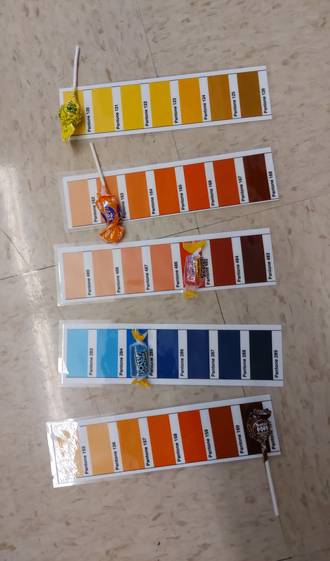
 1. It was easy/hard to decipher the colors, and why?
It was easy to decipher the colors, because it was pretty easy to see what tones weren't the same once we put the candy in front of them. 2. How does the Pantone system improve design and printing? It provides a base system of colors that people can use to communicate what they mean effectively. 3. When would be a good time to use Pantone colors in this class? When we are designing things that are meant to be printed, or when working in groups so we can communicate better.
0 Comments
It was easy to use my obstruction "traveling abroad" because I had a ton of ideas on what I wanted o do and it was a really broad subject. I was successful with incorporating unique ideas into my work, but I think I could have done better by adding a gradient to them to make them pop like real emojis.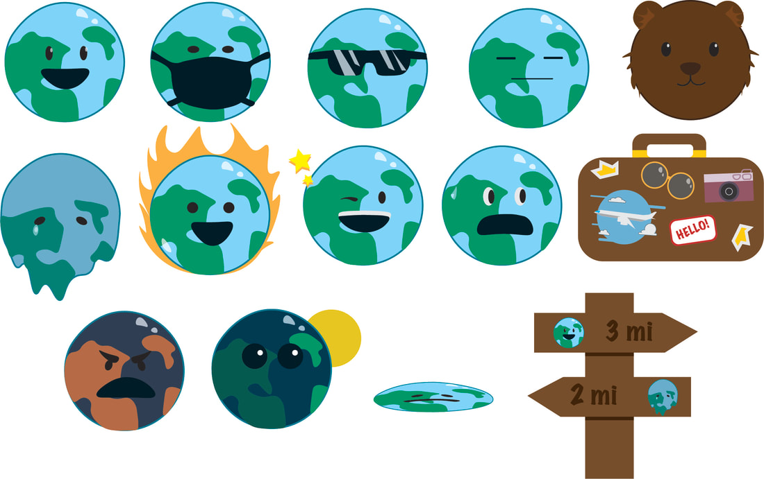 |